Introduction to Branding Guidelines
At A Place for Animals, our branding guidelines are the blueprint for maintaining consistency and integrity across all aspects of our brand identity. Consistent branding is essential for building recognition and trust among our audience, ensuring our messaging remains clear and cohesive.

Brand Identity
- Mission Statement: A Place for Animals is dedicated to fostering a deeper understanding and appreciation for the creatures we share our planet with.
- Vision Statement: We envision a world where every creature is treated with compassion, respect, and understanding.
- Brand Values: Our core values include compassion, integrity, and a commitment to education and awareness.

Logo Usage
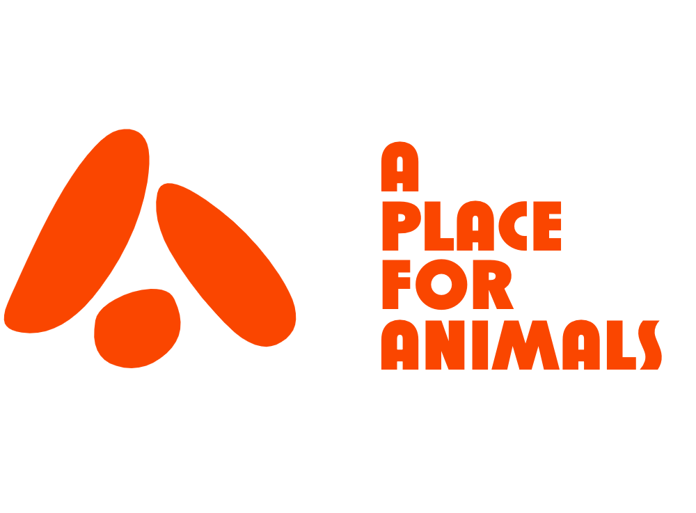
Our logo serves as the visual representation of our brand and should be used consistently across all platforms and materials. The logo features a vibrant orange hue, representing our passion and energy for animal welfare.
- Clear Space and Minimum Size: Maintain a clear space around the logo equal to half the height of the logo. The minimum size for the logo is 50 pixels in digital applications and 0.5 inches in print.
- Proper Usage: Utilize the primary logo with the orange color scheme whenever possible. Alternative versions may be used when necessary for legibility or aesthetic purposes.
Typography
Typography plays a crucial role in our brand’s visual identity, conveying our message with clarity and consistency.
- Primary Font: Our primary font is “Arial,” chosen for its versatility and readability across various platforms.
- Secondary Font: “Arial Narrow” serves as our secondary font for headings and subheadings, providing a complementary visual element to our primary font.
Color Palette
Our color palette reflects the vibrancy and diversity of the animal kingdom, with bold primary hues and subtle secondary tones.

- Primary Colors: Our primary color palette consists of shades of orange, ranging from #fa4600 to #ff924c, evoking warmth and energy.
- Secondary Colors: Subtle shades of gray, ranging from #352e2c to #fdfcfc, provide contrast and balance to our primary palette.
Visual Elements
Our visual elements, including photography and illustrations, play a crucial role in conveying our brand’s message and values.
- Photography Style: High-quality, vibrant imagery that showcases the beauty and diversity of animals and their habitats.
- Illustration Style: Simple, yet expressive illustrations that complement our brand’s playful and approachable tone.

Voice and Tone
Our brand voice is friendly, informative, and compassionate, reflecting our commitment to education and awareness.
- Brand Voice: Conversational yet authoritative, with a focus on providing valuable information and fostering empathy towards animals.
- Tone Guidelines: Maintain a positive and inclusive tone in all communications, avoiding jargon and complex language whenever possible.
Brand Applications
Our branding guidelines extend to all aspects of our brand, including digital and print materials, merchandise, and more.
- Stationery: Utilize branded templates for business cards, letterheads, and envelopes to maintain consistency in all written communications.
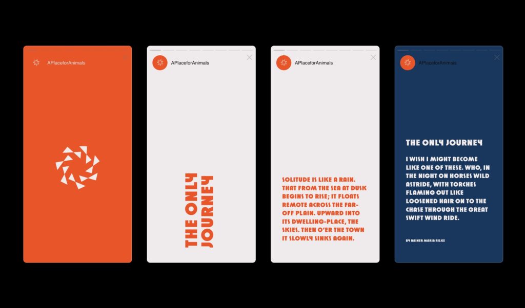
- Digital Assets: Follow guidelines for branding on websites, social media profiles, and email signatures to ensure a cohesive online presence.

Brand Compliance
Consistency is key to maintaining the integrity of our brand identity. Refer to these guidelines regularly to ensure adherence to our brand standards.
Contact Information
For inquiries or assistance regarding our branding guidelines, please contact:
Thank you for being so committed to upholding our brand standards and helping us fulfill our mission at A Place for Animals.


